Beyond the Logo
A practical guide to beyond the logo, with decisions, implementation checks and limitations for business teams.
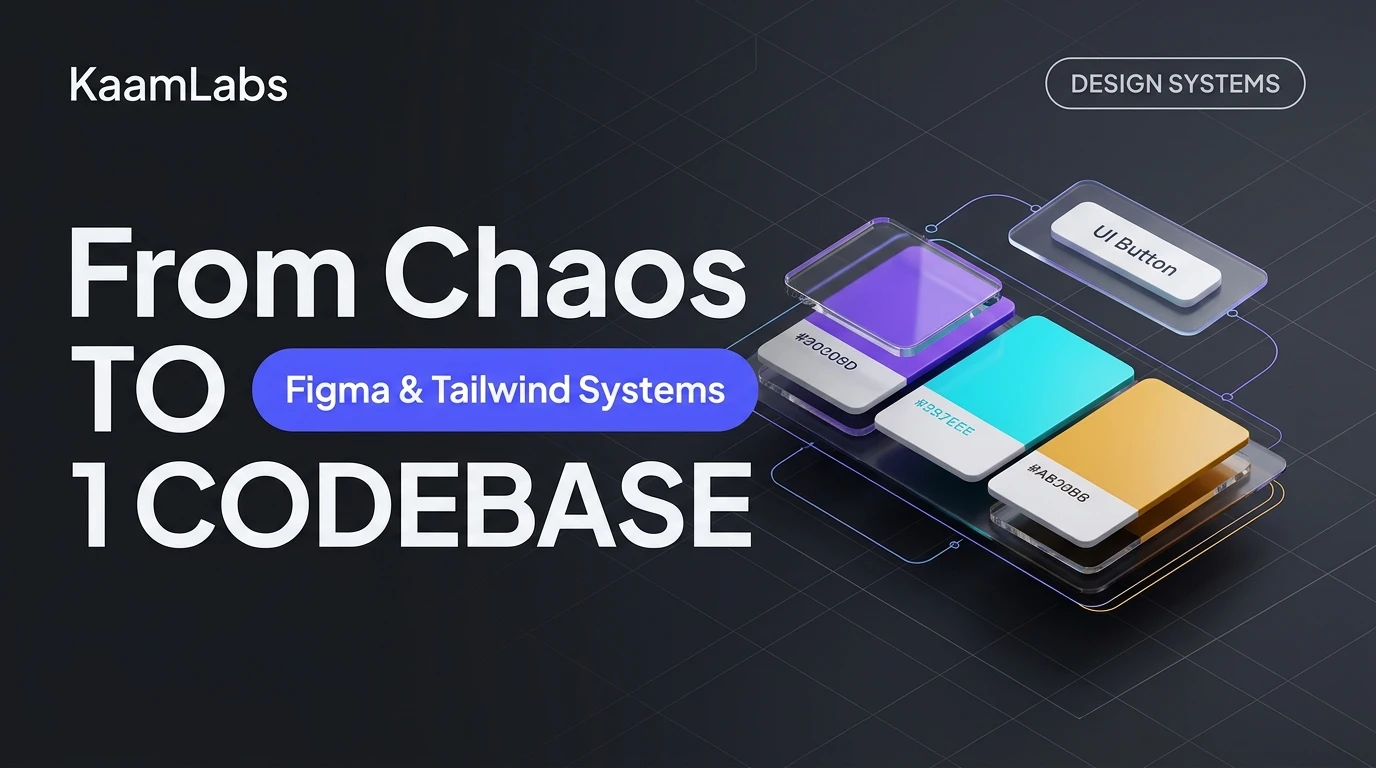
The Hidden Cost of UI Fragmentation in Indian Tech Companies
When an Indian startup scales past 15 engineers or when a mid-market enterprise manages multiple customer-facing portals, a silent operational tax takes hold: design entropy.
Without a rigorous tokenized design system:
What Is a True Enterprise Design System? (Beyond Component Libraries)
A design system is neither a Figma UI kit nor a component library like shadcn/ui. It is the automated governance contract between design intent and production execution.
┌─────────────────────────┐
│     Figma Variables     │  (Colors, Spacing, Typography, Radii)
└────────────┬────────────┘
             │  Style-Dictionary API / Tokens Studio
             ▼
┌─────────────────────────┐
│   Automated Token JSON  │  (Design Tokens Community Group DTCG Standard)
└────────────┬────────────┘
             │  GitHub Actions CI/CD Pipeline
             ▼
┌─────────────────────────┐
│   Tailwind Config & CSS │  (theme.extend.colors, spacing, fontFamilies)
└────────────┬────────────┘
             │  Zero-Runtime Tree-Shaking
             ▼
┌─────────────────────────┐
│ Production Next.js App  │  (Atomic UI Components: Buttons, Inputs, Tables)
└─────────────────────────┘
The Three Foundational Pillars
| Architectural Layer | Responsibility | Tech Stack Standard |
|---|---|---|
| Pillar 1: Primitive Tokens | Raw, context-agnostic design values (e.g., `zinc-900: #18181b`, `spacing-4: 16px`). | Figma Variables & DTCG JSON |
| Pillar 2: Semantic Tokens | Context-specific intent mappings (e.g., `surface-primary: var(--zinc-900)`, `action-hover: var(--coral-500)`). | CSS Custom Properties & Tailwind |
| Pillar 3: Component Primitives | Accessible, headless, keyboard-navigable atomic components. | Radix UI / React Aria + Tailwind CSS |
Step-by-Step Implementation Blueprint: Figma to Tailwind Pipeline
Here is the exact production architecture KaamLabs implements for enterprise software clients.
Step 1: Exporting Figma Tokens as Standardized JSON
Using the Tokens Studio plugin or Figma’s native Enterprise REST API, design tokens are extracted as versioned JSON contracts:
{
  "color": {
    "brand": {
      "primary": { "value": "#FF4D00", "type": "color" },
      "surface": { "value": "{color.zinc.950}", "type": "color" },
      "border": { "value": "{color.zinc.800}", "type": "color" }
    }
  },
  "spacing": {
    "touch-target": { "value": "48px", "type": "spacing" },
    "gutter-mobile": { "value": "16px", "type": "spacing" },
    "gutter-desktop": { "value": "32px", "type": "spacing" }
  }
}
Step 2: Transforming Tokens with Style-Dictionary
In your CI pipeline (`.github/workflows/tokens.yml`), run Amazon's open-source `style-dictionary` engine to compile the JSON tokens into a typed Tailwind theme module:
// tailwind.tokens.js (Generated automatically - do not edit manually)
module.exports = {
  colors: {
    brand: {
      primary: 'var(--color-brand-primary, #FF4D00)',
      surface: 'var(--color-brand-surface, #09090b)',
      border: 'var(--color-brand-border, #27272a)',
    }
  },
  spacing: {
    'touch-target': '48px',
    'gutter-mobile': '16px',
    'gutter-desktop': '32px',
  }
};
Step 3: Injecting Tokens into `tailwind.config.ts`
import type { Config } from 'tailwindcss';
import tokens from './styles/tokens/tailwind.tokens';

const config: Config = {
  content: ['./src/**/*.{ts,tsx}'],
  theme: {
    extend: {
      colors: tokens.colors,
      spacing: tokens.spacing,
    },
  },
  plugins: [],
};

export default config;
Measurable Business ROI for Indian Founders & CTOs
Transitioning from ad-hoc styling to a tokenized enterprise design system yields immediate, compounding dividends:
Frequently Asked Questions
What is the difference between a UI component library and a design system?
A component library (like shadcn/ui or MUI) is a collection of pre-built UI widgets. A design system includes design tokens, brand guidelines, typography scales, accessibility contracts, and automated synchronization pipelines connecting Figma design files to production codebases.
Can an existing Next.js or React application adopt a design system incrementally?
Yes. An enterprise design system can be introduced incrementally through an 'adoption gateway.' Primitive tokens (colors, spacing, and typography) are standardized first in the Tailwind configuration, followed by the progressive migration of key high-traffic components like buttons, modals, and input fields.
Architectural Cross-References & Implementation Guides
To expand your technical implementation strategy, evaluate these companion engineering blueprints and core platform frameworks:
Put this into a project brief
Describe the user task, the current bottleneck, the systems involved and how you will measure a successful result. Ask for a scoped pilot and acceptance checks before expanding the implementation.
Discuss a website project or explore published client work.
Essential Takeaways & Clarifications
A component library is a collection of pre-built UI widgets, whereas a design system includes tokens, brand rules, typography scales, accessibility contracts, and automated synchronization pipelines connecting Figma to production code.
Use this guidance in context
Technical examples are starting points for a project review. Platform requirements change, and results depend on implementation and starting conditions. Refer to the linked documentation and test the actual workflow.
Send a correction with the page URL to hello@kaamlabs.in.
Consult the source for current requirements and the context of each referenced statement.
Explore delivery details, project examples and practical buying guidance.
Ready to Upgrade to Sub-Second Modern Architecture?
Eliminate development delays. Ship clean Next.js, FastAPI, or mobile systems with dedicated engineering and milestone-driven delivery.
Related Engineering Deep-Dives
When to Redesign a WordPress Website
Web DevelopmentWhen to Redesign a WordPress Website
The 24/7 Digital Salesperson
From Figma Prototype to a Production SaaS MVP
Custom Software