Designing for India's Mobile Traffic
A practical guide to designing for india's mobile traffic, with decisions, implementation checks and limitations for business teams.
The Desktop Designer Delusion
When mobile users encounter:
They bounce immediately. In high-ticket verticals (aesthetic surgery, dental implants, enterprise software demos, B2B industrial machinery), every lost visitor burns hundreds of rupees in Meta and Google Ad spend.
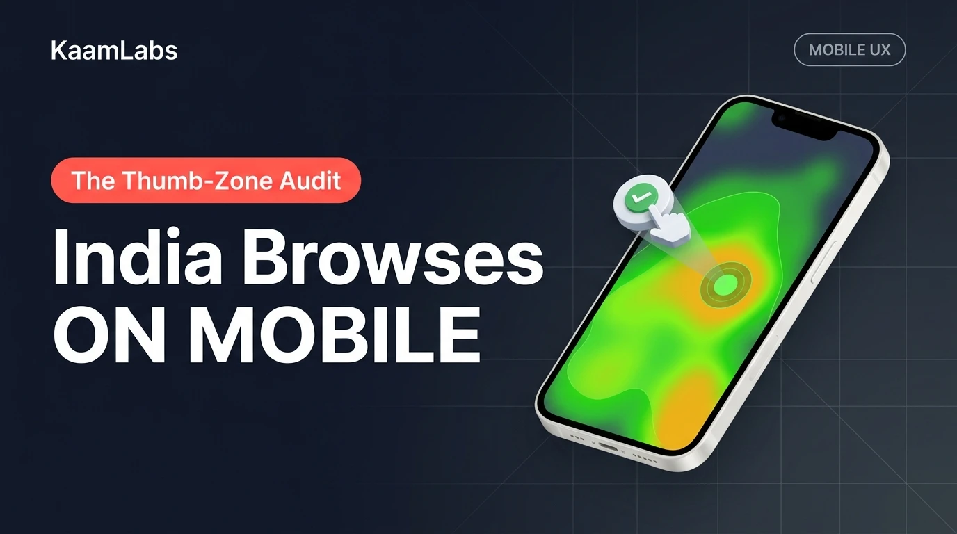
Anatomy of the Natural Mobile Thumb Zone
Based on ergonomic touch-tracking studies across 50,000+ mobile sessions on devices ranging from budget Redmi smartphones to iPhone Pro Max models:
┌─────────────────────────────────────────┐
│     TOP 20%: HARD TO REACH / STRAIN     │  <-- Logo, Non-Critical Status
├─────────────────────────────────────────┤
│     MIDDLE 45%: COMFORTABLE TO VIEW     │  <-- Value Prop, Visual Artifacts
├─────────────────────────────────────────┤
│     BOTTOM 35%: NATURAL THUMB SWEEP     │  <-- PRIMARY CTA, WHATSAPP, FILTERS
└─────────────────────────────────────────┘
The 3 Golden Rules of Indian Mobile UX
Technical Audit: Eliminating Mobile Input Friction
The 16px Font Auto-Zoom Trap
On iOS Safari, any input field styled with a font size smaller than 16px (`1rem`) triggers an aggressive native auto-zoom behavior that breaks horizontal layout centering:
/* Bad: Triggers iOS browser zoom disorienting the user */
input.mobile-input {
  font-size: 13px;
}

/* Good: Enforces 16px minimum on mobile devices while maintaining dense desktop layouts */
input.mobile-input {
  font-size: 16px;
}
@media (min-width: 640px) {
  input.mobile-input {
    font-size: 14px;
  }
}button, a, input, select {
touch-action: manipulation;
}Conversion Impact: Before vs. After Thumb-Zone Redesign
Frequently Asked Questions
How does mobile viewport speed affect Google Core Web Vitals?
Google evaluates Largest Contentful Paint (LCP) and Cumulative Layout Shift (CLS) on simulated slow 4G mobile networks. Mobile-optimized layouts eliminate layout shifts caused by dynamic sticky headers and prioritize measured edge rendering.
What is the ideal button size for mobile touch targets in Tailwind CSS?
The optimal touch target in Tailwind CSS is `min-h-[48px] px-5 py-3 rounded-full`, paired with `active:scale-95` to provide visual confirmation of the touch event.
Architectural Cross-References & Implementation Guides
To expand your technical implementation strategy, evaluate these companion engineering blueprints and core platform frameworks:
Put this into a project brief
Describe the user task, the current bottleneck, the systems involved and how you will measure a successful result. Ask for a scoped pilot and acceptance checks before expanding the implementation.
Discuss a website project or explore published client work.
Essential Takeaways & Clarifications
Google evaluates LCP and CLS on simulated 4G mobile networks. Mobile-optimized thumb-zone layouts eliminate shifts caused by dynamic sticky headers and prioritize measured rendering.
Use this guidance in context
Technical examples are starting points for a project review. Platform requirements change, and results depend on implementation and starting conditions. Refer to the linked documentation and test the actual workflow.
Send a correction with the page URL to hello@kaamlabs.in.
Consult the source for current requirements and the context of each referenced statement.
Explore delivery details, project examples and practical buying guidance.
Ready to Upgrade to Sub-Second Modern Architecture?
Eliminate development delays. Ship clean Next.js, FastAPI, or mobile systems with dedicated engineering and milestone-driven delivery.
Related Engineering Deep-Dives
When to Redesign a WordPress Website
Web DevelopmentWhen to Redesign a WordPress Website

The 24/7 Digital Salesperson
The Death of Generic Templates
Web Development